


Clinique Post-Production 5: Black Logos
The next part of this post-production class focuses on a crucial part of the shoot – introducing the black Clinique logos.
A key part of the Clinique advertising style is the black logos (watch how these were shot here), which is what Karl works on here. You’ll see each step as he selects the logos from one shot and copies and blends them with the main product shot.
In this class:
- Using curves adjustments to correct tone and colours
- How to select and recolour parts of an image
- How to transfer black logos from one shot to main image
- How to use different selection tools
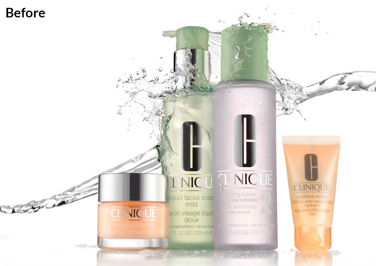
The silver Clinique logos shot as they are.
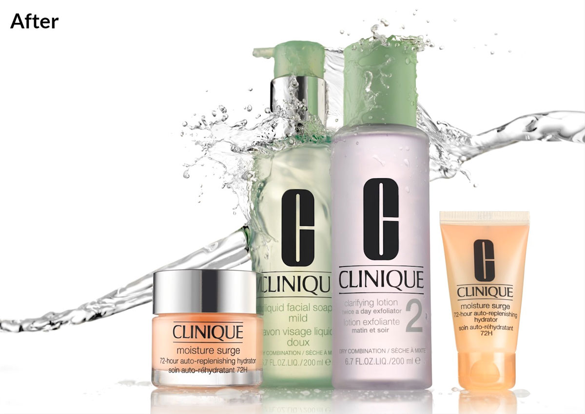
The Clinique image with the black logos comped in.
To see how this image was shot, watch the Clinique Style Advertising Shoot classes.
Questions? Please post them in the comments section below.
Comments
At 14min30s why do you add noise?
Hi, because if it is filled or painted in a solid tone it has no texture (or varying pixels) which all materials have in real life, so we add noise to make it look more like a real material.
Good stuff Karl. I’ve always known Clinique to have top notch ads, even in the days when I believe Irving Penn was shooting them. I’m going to try something similar with another brand, but before I do, I’ve got to learn more from the Post production classes…you’re doing a lot of stuff to retouch in this series, half of it I never heard of. Again, good stuff….I learned a lot. John F.
Thanks John, if some of the PS techniques covered are too advanced then please refer to the other main classes in our Post Production sections where we cover them in more detail. Cheers Karl.
Karl
Thank you for this series of videos, I have always struggled with water splashes, trying warp and puppet warp. I really like your simple layer and mask method. Keeping it simple.
Joe