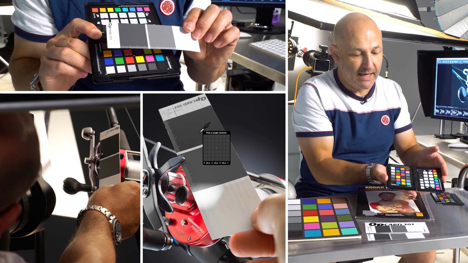

How to Use a Colour Checker Card
Check out this handy tool for keeping your colours looking good.
Colour checker cards (also known as colour checker passports) seem to cause confusion for some photographers.
In this class, Karl clears up some of that confusion, explaining what colour checkers are and how to use a colour checker.
You’ll see different types of colour checkers and grey cards as Karl explains the pros and cons of each. Taking an image into different pieces of software, Karl also shows how to neutralise an image using colour checkers.
In this class:
- What is a colour checker?
- Different types of colour checkers
- How to use a colour checker
- How to remove colour cast in an image
- How to neutralise images
- How to create a colour profile
Questions? Please post them in the comments section below.
Comments
i have a fuji x-t4 and in the wb option there are 3 personalized wb. I can shot to a neutral color and it saves this value. Is this the correct method to shot on a color checker and save the value for the entire shooting (if the lights remain the same)?
Hi, yes if the light and modifiers remain the same.
Why are you neutralizing from different grew squares, I thought to neutralize colors you always pick the middle grey square on your Xrite card?
My xrite software tells me that my camera “H6D” 50c has 6.5 stops dynamic range, can you tell me why HASSELBLAD says this camera has 14 stops??? Why such a discrepancy?
Hi, it doesn’t matter which grey square you choose they are all neutral as they all have no colour. Each square has different exposure but I like to check multiple squares because it may be that a slight amount of red might be more visible in the lighter tones than a darker grey square and as they are all neutral there is no harm in checking the numbers to see. Your measured dynamic range will also depend on how well you have set up the measuring scenario from a lighting point of view.
I know this is a more photo-focused piece, but I thought I’d share with anyone doing video work that there is an excellent plugin called MBR Color Corrector for Adobe Premiere Pro and After Effects that will automatically select patches from a pretty broad range of X-Rite and DataColor cards. I use it all the time to match up my A and B cams on interviews and it works quite well!
Hi Karl
Photoshop shows the values in 0 and 255 because it uses the color profile embedded on the file to show them, and if your file is Untaged (no color space) Photoshop will use the color space you have chose on Color Settings in Working Spaces until we assign a color profile
Lightroom on the other hand is using a color profile called Melissa RGB witch is a kind of mix between ProPhoto and sRGB. Melissa RGB uses the ProPhoto color spectrum and applies the Gamma curve from sRGB, providing the best of both Color Spaces.
That´s why we see only % on RGB Channels and not 0-255
Thank you for the info. Someone said there was also a way to switch LR to read in 0-255 but I haven’t been able to find that function?
Well there is a way but….probably is not what you want. At least not those values you get on C1 and you show on the videos.
It gives you RGB values but those are based on the paper you gonna print.
On the Develop Module you have the main window here you see the photo and between that main window and the film strip you have a bar, if you activate Soft Proofing , you can do it on the arrow pointing down at the right of the bar, LRoom will show the values on RGB but, just below the histogram window you will see Profile: and the numbers are based on the icc profile for the paper you chose.
If you like, and probably you know this, if you right click on the histogram you can ask LR to show Lab values.
Cheers
Thank you, great information.
Question about colour.
Every company I’ve worked at, fashion or interior. They all have the same problem when it comes to colour accuracy.
You take a photo of a soffa.
Then the soffa has to be viewed under a lamp with natural daylight and colour corrected by eye to get it to match in colour.
An xrite colour checker will not solve this problem.
Is there any other way that this could be automated, so you don’t have to sit and color correct all the products by eye?
Hi, fundamentally the sofa is a certain colour. That colour is determined by it being viewed under a certain light source and the bench mark for that would be normal daylight (5600K full spectrum light). If the sofa is then photographed using lighting that matches this and an Xrite checker is used as reference then there should be no problem. Any problem that occurs can only be down to the following: 1. Xrite checker has faded, 2. Lights you are using are not full spectrum and 5600K 3. Modifiers or room or other surrounding areas are causing a colour shift. 4. Camera sensor is low quality or in need of calibration
Thank you for the reply.
Yes i find it really strange and i cant figure it out why it differs so much.
I use D2 Lights so they are all in daylight spectrum. and the light we look under in order to do the color correction is also under daylight spectrum.
I dont use any modifiers, usually i bounce the light from a white surface or through a scrim.
I use xrite once the light is set.
Then i calibrate the colours, and from there it should be fixed.
But its not.
Most of the times the camera color profile does a better job at getting accurate colors.
Once i choose the xrite profile, things gets a bit over saturated and slightly wrong colours (almost brand new xrite passport)
Hi Karl,
Would you be able to do a class on your process for Art Reproduction please using the Scene Calibration and Reproduction Mode in Phocus? You talked here for example of using the Passport in each corner. Do you do a Colour Calibration for each? The results I get using Reproduction Mode are not consistent. BTW, the grey scale for some strange reason in the 24 patch area of the Passport is not all neutral. I think the second and fourth ones only. The large grey patch however is neutral. https://www.xrite.com/service-support/new_color_specifications_for_colorchecker_sg_and_classic_charts
bob
Hi Bob,
1.I have some of that covered in this video on Phocus software https://visualeducation.com/class/using-phocus-software/
2. I’d only put the card in the corner and centre of a painting to take the exposure measurements to make sure that the piece was evenly lit. If I’m using the same lighting and modifiers (which I would be) then the lighting colour will be the same across the image if the illumination is even and no polarisation is being used.
3. I’ve not had variations in neutrality on my squares, sometimes if they get dirty or are exposed to sunlight they can shift.
4. You may also find these two classes useful –
https://visualeducation.com/class/photographing-paintings-for-reproduction/
https://visualeducation.com/class/angles-of-incidence-and-reflection/
Thanks Karl.
I watched those and there are some great practical tips so thanks for those. Perhaps I was overthinking it and thought that you would need to do Scene Calibration with maybe a white sheet over the art and Reproduction mode, but probably not. I find the colour on the X1D is very accurate already but the 50MP may limit me with Art Photography. Cheers, bob
Hi Bob, the one thing you can be sure of with the X1D is it’s colour accuracy in the standard profile in Phocus. As long as you use the same lights/modifiers and put a grey card in as a reference then you should be fine.
Hi Karl,
Can you please resolve my confusion, you took initial shot with the gray card infront of the subject and then you neutralized it in your software. And when you take the next shot of your subject without the gray card how will you neutralize the final image without the gray card?
Thanks
Hi, with the software that I use and other such as Capture One, you only need to neutralise a given image to the checker card and then each image following that remains at those settings until you choose to neutralise again which isn’t necessary unless you significantly change your lighting or the items being photographed. I hope this helps, all the best Karl.
Hi Karl,
When you take a shot of a gray card – not to calibrate the camera –
but to neutralise the photo in whatever software program you are
working with, how does that info go into the camera? I understand
you are shooting tethered and the info goes from the camera to the
computer, but I don’t understand the other way round.
Also, would you use a gray card outdoors or in a different space
than the studio and calibrate the camera when shooting tethered
is not an option?
Thanks.
Hi Mondi,
Your first question the answer is it doesn’t go into the camera the correction information is only applied to the image data so the image itself is just a bunch of maths and a correction is made to that math.
Your second question the answer is yes you can use them wherever you like but there are instances where it wouldn’t make sense to make the picture neutral because the light wasn’t meant to be neutral such as candle light or the setting sun.
Hi Karl,
As a former school photographer, we used to calibrate
the camera after having photographed the grey card
with the correct lighting. That worked well for the purpose,
but as you pointed out in the video, it is a bit of a hassle
if you want to change lighting and experiment.
So as regards my first question, yes I thought as much.
What got me confused and was that I could not understand
that if the correction is applied to the image with the grey
card, how is this correction being transferred to the other
shots that follow?
Thanks for your patience 🙂
Hi Mondi, in tethered shooting software when you make such a correction you can set the software to remember the correction and automatically apply it to each following shot until you tell it otherwise. In some other software you just shoot the grey card and don’t worry about correcting it at that moment in time. When you get to the end of the shoot you can then sample the grey card to correct to neutral and then you apply a ‘copy colour correction’ command and then you can apply it to all the other images in one batch if you choose.
The other conversation that needs to be had about “colour correctness” is that not all human eyes perceive colour in the same way. For instance the older we get the less blue we perceive, so this really does become a minefield of “what is correct?”.
Hi Dallas, yes good point. Vision does deteriorate over time and every one ‘sees’ a little differently. For me the key is to just use the colour checker for a visual colour reference, make sure I have neutrality and then look at the product and the checker card in daylight to compare to what I have on my Eizo (which of course needs to be calibrated).
I do a lot of my editing in Lightroom on my iPad Pro. I’m a little concerned about how to set it up (i) in terms of colour (taking True Tone and night shift into around), and (ii) brightness.
Other than ‘I wouldn’t start here’ ( because it fits with my lifestyle) do you have any ideas / guidance on setting up iPads for photo editing.
I assume I’m not the only one …
Thank you
Hi Sally, the most important thing is to know that your Ipad screen at a certain brightness is in the ‘ballpark’ so you’ll need to compare it with the same image on it against a reference monitor. That way you will at least know that it is as close as possible to reasonable but you will have to disable the ‘auto screen exposure’ and ‘night viewing’ mode where it warms the picture up.
Thanks for getting back to me so swiftly.
Hi Karl,
Thank you very much for this video, I was about to buy a color checker…so if I understand et Lastolite White Balance for exemple can do the job??
Lastolite LL LR1250 12-Inch Ezybalance Card -Grey/White
Thank you
Louna
Hi Louna, yes they should be ok for standard neutral checks but a colour checker card is useful to reference and eyeball that the colours also look about right. If you plan on staying with us for a while, upgrade your plan and we include a colour checker card.
knowing that I want to specialize in product photography
hi karl
thanks for these important classes
so i want to ask you about how can we learn on your site efficiently
is there plan to guide begginer photographer
Note that I watched all the lighting videos
Hi Zakari, thank you. If you contact Sara in customer support through your home page she can put together a learning plan for your level. Cheers Karl.
Say “Adidas” again…. not sure I heard that correctly! lol
Adidas.
Such a good point about how clothes can affect colour and the reflectivity—we’ve made it a bit of a rule to only wear black when shooting important things in the studio, to try and at least control the influence.
Hi Philip, wearing all black is a good idea and I used to do that all the time, with tethered shooting though it means we can position ourselves and the triggering of the camera far enough away from the subject that it would be OK – but best to not wear a white suit 🙂