
Cosmetics Product Shoot
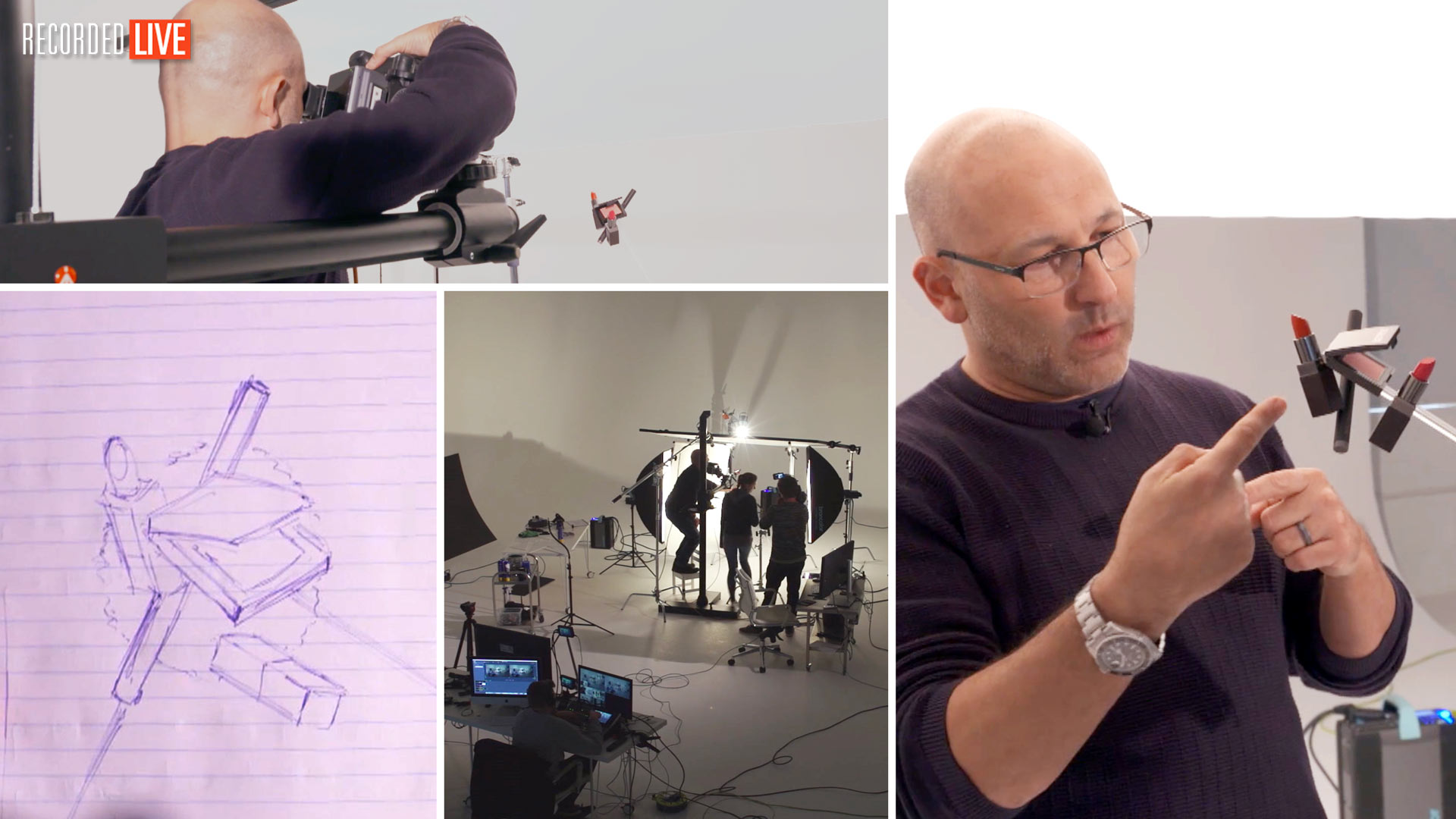
In this photography workshop, Karl attempts to bring his vision of a floating cosmetic arrangement to life in a highly complex cosmetics product shoot.
Cosmetics can be complex objects to light — they’re often small and can feature different textures. Taking the time to analyse your product is the first step and in this show you’ll see why this is so important as Karl shows you his process of setting up and lighting cosmetic products.
You’ll see each step as he explains the intricacies of such a product shoot and demonstrates how to overcome challenges such as how to light different surfaces of the products, how to control light spill around the set, how to secure the products in position and which lighting modifiers are the best for this type of product photography. To finish, Karl also shows you how to add dynamic, depth and leading lines by introducing additional elements and props to this product photography setup.
Regardless of whether you’re shooting lipsticks or skin creams, this show will cover powerful techniques for photographing cosmetics, as well as useful tips for general product photography too.
In this live product photography workshop we cover the following:
- How to photograph cosmetic products
- Product photography lighting
- Product photography tips
- How to light multiple textures and finishes: Lighting matte, gloss, lustre and chrome surfaces
- Lighting modifiers for product photography
- How to create depth in a photo
Other cosmetic product shoot classes you may enjoy include:
- How to photograph cosmetics on a gloss black backdrop
- How to create and photograph cosmetic swatches
If you have any questions about this show, please use the comment section below.
Comments
Hi Karl,
Thanks for one more great video .
Brilliantly planned I must say, to pack such great amount of information in those 2 hours.
Referring to the shoot – I have couple of questions, regarding positioning of scrims ( left and right ones )
1) As it can be seen two scrims form more like alphabet ‘A’ shape ( when seen from top ), so back area of scrims is closer to product as compared to front area- is there any specific reason for this way of arrangement?
Can the arrangement be done in alphabet ‘V’ shape, so now front portion of scrims will be closer to product as compared to back one. If not what are probable reasons, apart from not getting open space in front to keep reflective mirrors/papers etc.
2) Is there any thumb rule to maintain some minimum distance between scrims and product?….., as I have observed myself after a point when scrims are too close to product, texture of paper gets clearly visible in chrome finish & glossy black surfaces.
Thanks once again for putting together this show.
– Sanket
Hi Sanket, If you are using good diffusion material and it isn’t creased then you shouldn’t have any problems with it reflecting in the surface of your subject. My main reasons are partly to do with keeping enough working space but sometimes to do with the fall off of the light on the product as this can result in an increase or decrease in the gradient of light on non reflective parts of the product. There is no rule of thumb only the one that covers brightness of reflections verse brightness of subject which is also covered in this module – https://visualeducation.com/class/studio-lighting-setups-portraits-one-light-setup-21/
Thanks for the response Karl.
I am using diffusion material ( must be similar to lee as it looks ), usually referred to here in India as Gateway Sheet ( manufactured by company named Garware ).
Will try to get Lee and compare soon.
Will surely check the above mentioned Single light tutorial.
Good day.
Many thanks.
Hi Karl,
Hope you are well. A quick question, on your Mac, what is your brightness level set at please when you shoot tethered?
Kind regards
James
Hi James, although I shoot tethered into my macbook pro I’m not using that screen, generally I’m using and Eizo or recently an Asus Pro Art screen. If you change the brightness on the macbook pro it doesn’t affect the second monitor. If I have to shoot on location or with the mac screen then I’d say I have it about 3/4 but I don’t rely on it, instead I’ll trust the camera, histogram and colour checker card and will tweak RAW files later on Eizo.
Awesome as usual Karl. Can you use this sort of set up for a portrait shoot. I know its not a go to set up just wondered
Hi Wayne, yes you could but it is a bit convoluted for that. In most cases you don’t need the scrims as human skin is matt not gloss but you can still use them for a ‘softer’ look.
WONDERFUL
Thank Mark.
Hi Karl Im glad to be part of your training sessions. I have a doubt may be quite a simple question though. When it comes to product photography you have used soft key light which is actually a soft box and some backdrop spotlight and some snoot, key, fill and all but I have a doubt that what is the use of strobe light in product photography? I have seen differences using strobe light and softbox light on some youtube videos but in your videos I have seen flashes happening. Now my question is that Im planning to use Broncolor softbox with bright CFL light for product photography. Can we use it that way?
Hi Sandeep, I’m always in favour of using studio flash lighting as you get a greater amount of light which means you can work at a smaller aperture for greater depth of field without having to increase your ISO. Have you watched these?
https://visualeducation.com/class/types-of-studio-lighting/
https://visualeducation.com/class/understanding-flash-power/
Hi Karl
Enjoy your live shows on products… still waiting for the beer examples!
Please tell me what the model name is of the small C stand as I’m battling to find a short one.
Thanks
Elizabeth
Hi Elizabeth, we have live whisky and wine shoots and beer shoots in the product section. I’ll consider a live beer show at some point. The low C-stands I use are Avenger which are now owned by Manfrotto.
Amazing tutorial again, thank you very much for your dedication and help.
?
Awesome show, I enjoyed it tremendously. It must be very tiring for you guys. Thanks everyone for your incredibly hard work. You guys are the best.
Thank you ?. Tiring but fun.
It is always a pleasure to watch your
Shows, learned a lot .Thumps up
Thank you.
Hi Karl,
Top drawer tutorial as ever.
I’m a Profoto user (don’t judge), what do you recommend as an alternative way to get a similar effect as the Broncolor Pico light with the concentrated rectangular beam for shots like this?
Many Thanks
Mark
Hi Marco, I’m not aware of any other system available but someone on the show mentioned something coming out from Aperture? I’ve not heard of it though. Although if you watch the previous live show there’s something in there near the end that will give you a good idea. https://visualeducation.com/class/photographing-clear-liquid-bottles-gin-vodka/
Hi Karl
Fantastic show as always. In the course you briefly showed us the Chanel two lipsticks shot on your portfolio website, the one with a black background and the lipsticks lying on black spheres.
You mentioned, that was done with 2 lights, can you please tell us the position of the two lights. From the shadows/gradation it appears that both the lights were on the top behind a scrim, one coming from the right corner and the other from the left?
What material is the background and the spheres ? Is black your go to color in product photography?
Amit
Hi, Karl! Thank you for a great and complicated photoshoot!
I wish I could watch it live, but time difference is the problem here.
I have one question. You told in the beginning that when you shoot products, you’re being sent stuff. Do you usually work alone on the assignment without client supervising the shoot?
Is it always like that, or it really depends on the client?
Thank you!
Hi Yuliia, 20% of the time without a client there. 80% of the time with a client or art director (sometimes both). I pretty much always have an assistant to move things around to as it makes life a lot easier, more productive and better results. But for the first 4 years of my 23 year studio career I worked alot on my own.
Thank you for your response! I really appreciate that you always respond questions, even though you’re very busy 🙂
You are welcome, we are here to help 🙂
Absolutely agree to above comment.
Thanks Karl for not just answering, but sharing without holding back any detail.
Specifically mentioning about first 4 years of your career, makes viewer like me feel at ease 🙂
So may things to learn from comments section as well.
Thanks Karl !
Excellent, inspiring and very informative demonstration! I would love to see a PS comp session of this image in the future.
Hi Geoff, thank you and yes that’s what we will be doing.
loved the show, and the lay out looking forward to comping all the layers
thanks as always you and you team
frank
Thanks Frank.