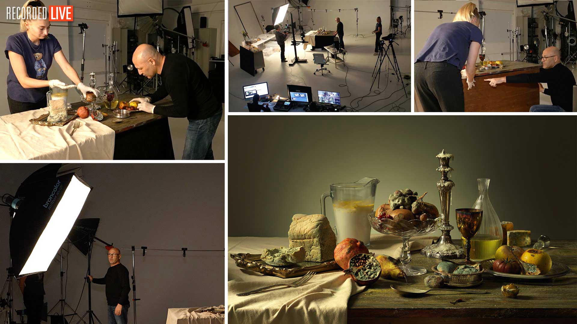

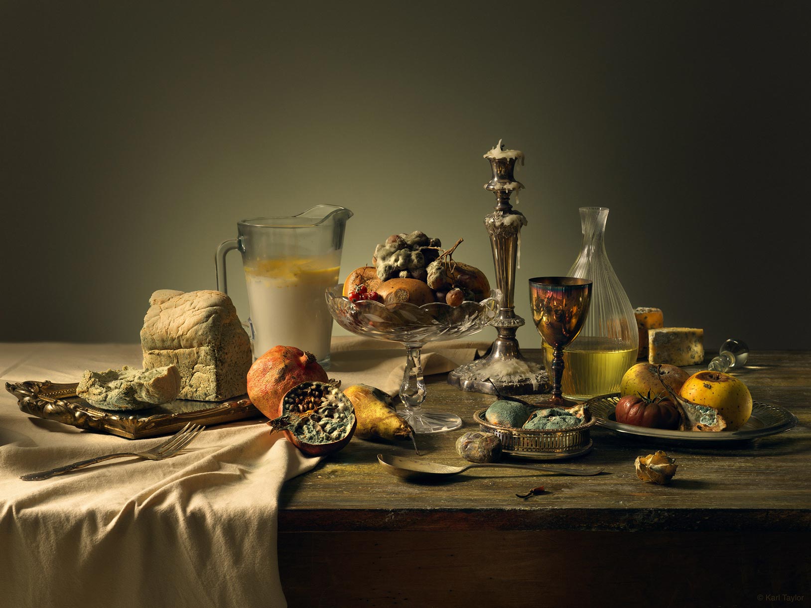
Still Life: Natural Decay
In this live show, Karl takes inspiration from the historical Old Masters to create his own ‘Natural Decay’ still life photo.
This show covers the start-to-finish shoot as Karl explains his concept for the image, his props, composition, camera settings, styling, lighting and colouration.
You’ll learn how to create the ‘warm’ look associated with this style of imagery using basic colour adjustment methods before seeing the simple lighting setup used to capture the final image.
Using just a couple of lights (this setup is achievable using just two lights, though three is better), Karl explains how to control the light using flags and reflectors and how, by working methodically and taking care of the little details, you can capture a near-perfect image in-camera.
Topics covered in this show include:
- How to set up a still life photo
- Camera settings for still life photography
- Composition and styling for still life photography
- Props for still life photography
- How to control light and shadows using flags
- Using reflectors to create additional light
To learn more about focus stacking, the following classes may be of interest:
- Live Workshop — Focus Stacking Shoot
- How to Focus Stack – Rings example
- Creating DIY photography backdrops
If you have any questions about this show please post in the comment section below.
Comments
AWESOME! ❤ BEAUTIFUL ❤ Thank YOU very much 😁
Thank you.
Hello Karl,
Just watched this (fantastic!) video for the second time, as I’m working on a few still lifes of my own. When it comes to taking your time, what do you do when you’re working with something perishable that needs to look fresh, like cut flowers or live plants that start to lose their vim and vigour after spending a day in a dark studio?
Thanks!
Irene
Hi Irene, thank you. It’s best to work in a cool studio for perishables and wear a jumper! That way you’ll have more time with the produce looking good. From my experience on food shoots keeping the items cool and fresh in the fridge and having spares for testing and then bring the hero’s out when you’re ready. See Anna prep some stuff in a similar way in our food photography courses.
You are just amazing in the Art of teaching.
I wish we could have you here in Austria (Salzburg) for a workshop in the near future.
You mentioned a link concerning the wood…
Looking forward for als the upcoming lessons.
Kind regards from Austria
Sébastien
Thanks Sebastien much appreciated. Here’s the link to the wooden surfaces – https://visualeducation.com/class/diy-backgrounds-for-photography/
Amazing show Karl, I love the way you teach. I learned from you way more than from other workshops and photographers I paid couple grand to. Wish I knew about you 5 years ago, I would have showed up at your door begging to take me in to be your assistant for few months 🙂
Cheers!
Very kind thank you.
It is a never decaying pleasure to watch you in action with all your enthusiasm!
Carlo
Thank you 🙂
Was really looking forward to this video and as usual it did not disappoint! I am inspired to try my own version of it, hoping my gf will not kill me cause of the smell LOL. Cheers. Matteo
Ha Ha good luck with your girlfriend!
Hey Karl,
Amazing workshop as always… Just a quick question…
Throughout the whole video, you emphasize the importance of the textures on the decayed food items, the cloth and the table… However, the background you chose is super smooth with the exception of the bowl of light.
Did you consider using, may be, a hand painted canvas backdrops that may resemble a cracked or textured old wall, for example? Or, any other background with texture, for that matter?
I was just thinking that a background with texture would complement the overall photo a lot better. So, I would love to know your way of thinking in deciding the background you used in your final photo.
Hi Thank you, actually I looked at still life masters paintings as my reference. I came to realise (for me anyway) that the most believable or realistic in terms they could have been someone’s real home were the ones with plainer backgrounds. The ones with overly mottled or textured backgrounds looked like a deliberate attempt by the artist to add something to the painting that wasn’t necessarily authentic to a scene in a room and was more akin to a scene set up in an artists studio. After considering this further I tested a mottled background on my test day of shooting (a brown mottled leather) and from that it confirmed my decision to go with a plain wall more likely to represent someone’s home. Additionally from my tests any more than a very light texture and the juxtaposition between the objects and the background was less clear. Obviously the decaying food was the key subject so anything that I felt would distract from that too much I decided against. However given that I felt a very light texture or mottle might be acceptable I decided on plain knowing I could add or create that in post if necessary however, having now retouched the image and being happy with my final version, at this time, I think it’s where it needs to be. You can view the final retouch on http://www.karltaylor.com
Hi Karl,
Thanks for the excellent live show. I really enjoyed it.
You mentioned focus stacking by a software, Helicon. I was wondering why not just using the focus stacking and photo aligning function in Photoshop? Does the software perform better than Photoshop?
Thanks again.
HanWei
Hi Lee thank you very much, that is all explained in the following live show where I do the retouching. I demonstrate the focus stacking and the question comes up about photoshop and other software during that show. I hope you have time to view this, all the best Karl.
Ti conosco da poco , mi dispiace non capire la tua lingua , complimenti sei bravissimo
Thank you.
Awesome work! Thanks Karl for this workshop.
Thank you.
Enlightening explanation! Nice to see in action how one main light could be distributed into small light patches. Thank you!
Thank you and you’re welcome.
Karl, I am sorry I missed this live show (job rules, unfortunately).
Your image is a masters painting. I love it.
I am guessing KTE studio must have stunk for a while with all that rotten stuff, huh?
Anyway, fantastic show!!!
Jorge.
Hi Jorge, thank you and yes it was pretty horrible when you opened the plastic crates. I referred to a lot of artwork for the inspiration but I also looked at a couple of your shots too as I remembered them having the right feeling about them. I was very pleased with the result but I’m going to follow this up with a live show on the post production. There won’t be much but I think it will be interesting for people to see my final colour/contrast choices for the image. Your new site is looking good by the way. All the best Karl.
Outstanding live show.
I loved this show as it was fascinating to see the old style painting come to life in photography.
I aspire to shoot these type of shots, and I want to thank you for sharing simple, practical ways to build the shot up. I am working on doing your leg shot this week, but will pop some fruit and veg into a bucket to ripen for a nice Valentines Day art shot.
2021 is off to a great Taylor start!
Thanks Derrick, glad you enjoyed it.
Hi Karl,
Absolutely fab class, l loved it.
Question: I noticed the cloth used on the table was not ironed and folded as was the custom back during the lives of the old masters and I was wondering if this was an intentional choice and why?
Your teaching style is excellent, you’re certainly one of the best tutors I’ve experienced yet.
Juliana
Hi Juliana, thank you so much and glad you enjoyed the show, no unfortunately I didn’t make an intentional choice on the table cloth.
Thanks again great show loved the set up ,
also thank you for your kindness i revived in the mail this morning ,pouches.strap,color checker
yes i am with many years and enjoy your DVD set i got from your good self even today , i fall back on them
i have always enjoyed what your shows has to offer from day one to today and as long that happening i will here watching .
thanks again for your kindness .Karl
Frank Garvan
Thanks Frank, we truly appreciate your support to our platform and your enthusiasm for what we do. All the best Karl.