
Luxury Watch Product Photography
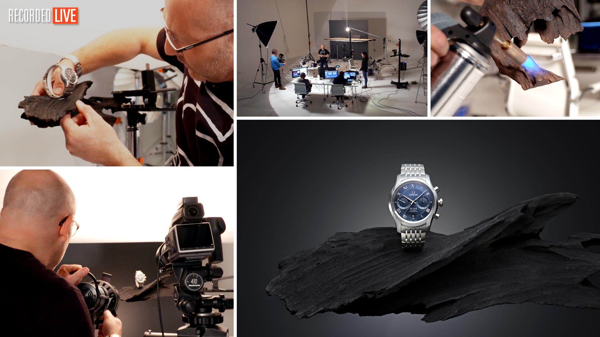
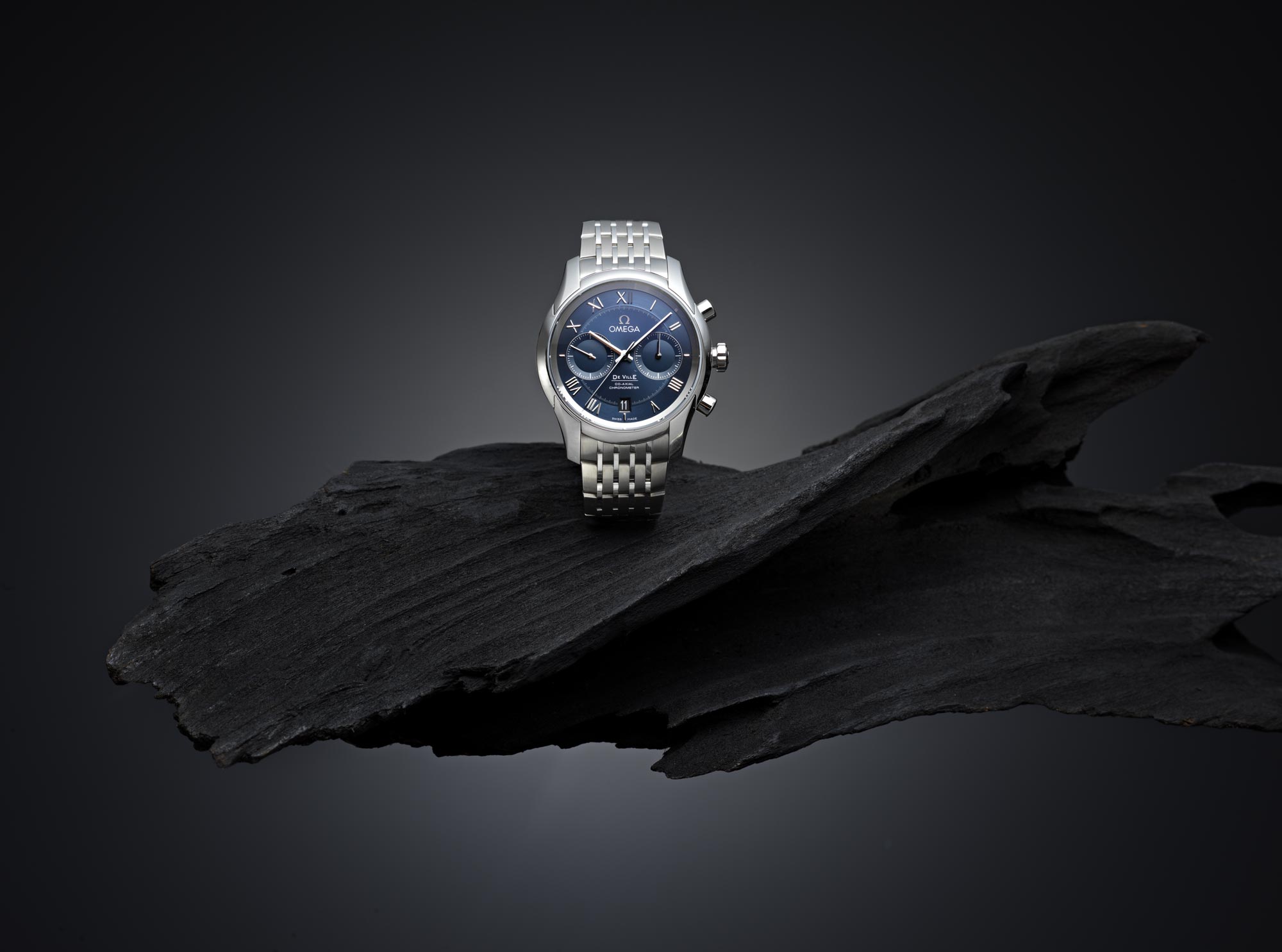
In this product photography class, Karl demonstrates how to capture a professional-level image of a luxury watch.
Watch as Karl builds up to the final shot, walking you step-by-step through his creative process, from selecting suitable props to lighting the shot, plus the simple post-production required to finish it off. He also shares valuable insights into photographing a product like this, revealing a number of industry secrets that all contribute to the beautiful final image.
Luxury Watch Product Photography
In this class:
- How to photograph a luxury watch
- Watch product photography lighting tips
- Photographing and lighting shiny surfaces
- Achieving a gradated light with a point light source
- Using reflectors and flags
- Useful post-production techniques for product retouching
If you have any questions about this photography workshop, please post them in the comments below.
Comments
Thanks for your response Karl, much appreciated. I found an old Sigma 70-300 macro lens in the cupboard… it’s helped hugely in getting that detail in the watch shot. I’m working in a tiny room 2.5m x 3.5m so I’m never going to achieve perfection with lighting – and light pollution does cause a lot of problems in such tight spaces, but I’m really happy with the results I’m getting in trying to re-create the product shots from your tutorials… it just requires more shots and photo stacking in photoshopping later.
Hi Karl,
I’m just getting started with product photography and working with what I have… your tutorials are amazing and are helping so much! I’m finding my images on small items such as watches are not very crisp. I’m just wondering what kind of (affordable) lens I would need for shooting a watch. I have a Pentax k1 and I’m using a Pentax 50mm f1.2 lens. Are tilt shifts and macro lenses vital for this type of work?
Thanks, Rich (site won’t let me change my username 😉
Hi Rich, macro lenses are designed for crisper shots when using small apertures such as f11 or f16 which is often the case with product photography. Anna who you will see in our food tutorials uses a Canon with a 100mm macro and that would also be a good type of lens for product photography. How ‘crisp’ an image is though has lots to do with your lighting angles/contrast levels, focus accuracy, and camera and subject stability too, as well as ensuring no light pollution from ambient light.
Love your work I have a question? What is the name of the clamp used to hold the wood on the stand? also the best way of holding an acrylic sheet 24 by 24 above my work area? Thanks!
Hi, thank you.
1. It was a Kupo clamps
2. 2 x C-stands with grips/rods or make your own purpose built frame and fix to a frame that you can clamp between c-stands. Don’t also forget you can use diffusion material that is lighter as in many of our other tutorials.
This video demonstrates that you need an assistant. It was pretty critical here with the positioning of the curved reflector.
I’d say an assistant is a studio photographer’s most important asset.
Karl, this is undoubtedly the most valuable monthly subscription I have! As with all other videos on KTE that I have watched so far, you demonstrate and convey technical concepts and information with such clarity and a refreshing ‘matter-of-factness’! I’m Relatively new to KTE, but cannot wait to sink my teeth in, some more! Thanks
Thank you Stephen.
Unbelievable image! As I mainly do Jewelry Photography these days you make it look so easy when I dare say it’s one of the hardest types of photography there is. This video shows how much you have mastered bending light to your will, thank you for the insight and wisdom.
Thank you Keith.
Wow you make things look easy! I know you have done this again but it is now on my to do list when I get home!
Hi Karl,
As much as I would like to replicate your gray backdrop when my space allows, do you have a recommendation for another option such as fabric or some other option?
Thanks, Kevin
Hi Kevin, for this type of photography I would insist on a very flat surface, even a smaller piece of MDF or firm card that can be painted the correct colour would be best. Fabrics or paper backdrops just form too many ripples for this type of work.
Hi Karl, thanks for the critique and the instructions on aligning the layers, I will give it another go. And I will check out that shadow top left. Thanks again.
Hi Karl, they just seem to move around – in other words I try and drag them and then just move themselves to that position on the screen, I ended up copying and pasting one on top of another and doing it that way. https://www.flickr.com/photos/28356703@N02/40083298300/in/dateposted-family/ Pretty pleased with the result in the end but not as an easy workflow as you showed.
Hi Gary, it’s a good result but there needs to be more light under the lower part of the strap and I think there is a faint shadow on the background in the top left. As for the layers moving around that is strange. Usually as long as the image is exactly the same size and not cropped when you drag one layer from one image into another then they would snap to the corners or centres (in PS cc at least anyway) otherwise lower the opacity and move the layer carefully whilst you can see through it. Alternatively use the ‘load images into a stack’ command and then say ‘allign layers automatically’ and that usually works well.
Hi Karl, Great workshop once again, please help though?? I have 4 images I want to layer on top of each other, I can’t seem to drag them onto each other like you do at 1hr 15min. I try to place them but it just moves them what am I doing wrong please? I am using Abobe Photoshop CC, opened them as RAW files first, then into PS. Thanks in advance. Rgds Gary
Hi Gary, do you get the layers one above the other or is it that they just don’t line up with each other?
Truly outstanding tutorial, I got alot out of this one! Just ordered my first snoot in fact.
Thanks Robin.
I’m glad I’m not Thomas!! I totally get why you wanted degradation of light on this shot. This is why I am learning from you. Your a master at lighting. I dont believe in making these mistakes when I can avoid them through education from you Karl. I love the eloquence of your shots.
Thank you Gina, very kind.
Thanks Tim!
Second question (I’m watching this in stages…)
Why not use a white paper reflector instead of silver for fill of the bottom of the watch? Isn’t a Matt white reflector more diffuse and less intense than silver? That way you don’t need an ND gel on top of a silver reflector. Is there another reason for this construction?
Hi Kryn, the white card may work but would not reflect the light in the same way and would lose some of the sparkle and the ND filter over the silver allowed and Karl to carefully control the amount of light reflected back onto the watch. A slightly matter silver card may have also worked it is a case of trying a few things out and seeing what looks best.
That looks amazing! One question on the large scrim: what is the minimum size you need for a shot like this? Do you have any advice on determining scrim size based on the shape of the object? Also, how would you manage scrim size for smaller studios?
Ok, that was three questions, not one…
Hi Kryn the bigger scrim is always easier to work with as with a smaller scrim you would need to be careful of the position of the scrim as you can get issues with the edge of the scrim showing in the product and/or the gradient light cutting of early. I would make the scrim as big as you can fit into your studio. We have an example of how we make the scrims here this example is using tracing paper and so we have made it double sided. If using the Lee Filters 216 diffusion roll you will only need to add to one side of the frame as if is much thicker and stronger than tracing paper.