
Matching Hues Fashion Shoot
Transform your fashion photos by getting creative with colour.
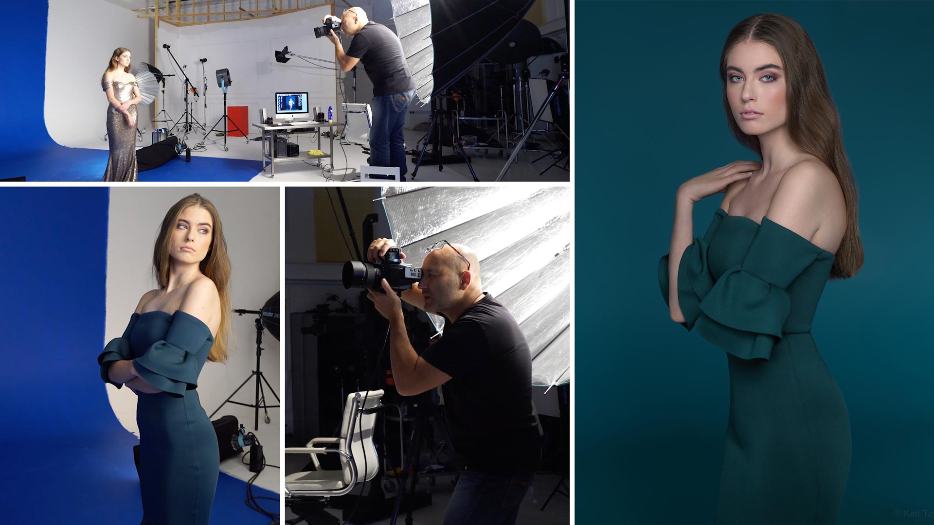
In this fashion photography class, you’ll discover how careful lighting and close attention to detail can turn a ‘good enough’ photo into something really special.
Watch as Karl tests various different outfit and makeup combinations, experimenting with different backgrounds and adjusting his lighting setup until he achieves the result he’s looking for.
The simple tools and techniques you’ll cover in this class will help you take your fashion photography to the next level!
In this class:
- Creative lighting setups for fashion photography
- Fashion photography tips
- Outfit selection for fashion photography
- Lighting modifiers for fashion photography
- How to change your background colour
- Working in Phocus software for simple colour adjustments
- Working with a team for a fashion shoot
If you enjoy this class, check out Sixties Fashion Shoot.
Questions? Please post them in the comments section below.
Comments
Hi Karl,
What alternative light-modifier to the Para 222 would you recommend for a small studio, and low budget?
Hi, a large focusing type umbrella but I’m not sure what’s out there, try and find something that’s as close to a true parabolic shape as possible. The effectiveness of the Paras is based on the physics of a Parabola – https://en.wikipedia.org/wiki/Parabola
Karl do you just keep painting over different colours on your backdrop?
Hi Andrew, yes we paint in many colours over time and then always paint it back to white, which usually requires 3 coats if it was a vivid colour before.
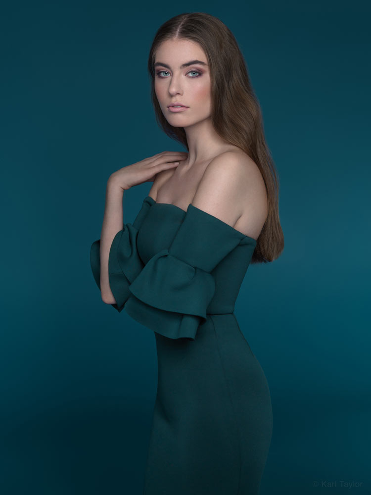
Thank you so much Karl. A quarter angled para now makes perfect sense on the beautiful softness that you have achieved. It’s super.
Regards, Peter
Thanks Karl. Yo make a very interesting point here.
In my first post I did look carefully at the skin on her back and shoulder and also at her hair and agree that there is nothing going on there which is why I assumed that the light source was being generated from a very low angle from behind. However, I never thought of the possible effect that the fabric could have on the light which I find very interesting indeed.
What fascinated me the most was the degree of softness of that “accidental” edge light and the fact that it only appears to be on the lower edges of her dress and not on the curves facing the camera. Your point about the source of light from behind being too weak obviously due to inverse square law is taken and makes perfectly good sense.
I am however really fascinated by what is going on here so please forgive me for persisting with this topic.
I would appreciate if you would be so kind as to share your thoughts on the possibility that the slightly shiny fabric could simply be reflecting some of the lighted walls behind her in the weave rather than as you suggested, light coming directly from the para222 in front, which being a much harder light source, would possibly have created some more pronounced specular highlights or is it simply because the para is focused directly on her upper body.
Further to your second point, if one were to place a strip box on the side to create some edge lighting on the fabric, then I assume that box would have to be very close, positioned very low and set at a very low power setting to create the amazing softness that we are seeing which shows the curves on her body perfectly without accentuating them and makes the dress look super comfortable to wear. Your thoughts please Karl.
Kind regards, Peter
Hi Peter, a low closeish softbox would be the best way to control any lighting but when backlighting even a light with a grid can work if you just want to create light in a specific place. As for the light coming from the wall or the para off the fabric i’m afraid I can’t possibly tell from the photo as I no longer have the dress or the set up to check. I would also mention though that from memory I think the para was turned at a quarter angle for this shot too?
Hi Karl. Your use of graduated light techniques are simply mind blowing and always so effective. Thank you for sharing those with us.
In this image I notice that there is a small degree of soft edge lighting on the back of her dress which creates just the right amount of separation from the matching hue background. You initially tried to add side lighting but then after placing the strip boxes on the floor to create the graduation, that was lost. However, it looks like the light on the right may have been angled or shifted sufficiently to illuminate part of the white wall behind the blue backdrop which I am assuming created that super soft edge light on her dress that I am referring to above.
Was that intentional and if so, would a white foam board or reflector positioned at 45 degrees or so to the strip box have done something similar?
Thanks once again for a fantastic tutorial
Hi Peter, thank you for your kind comments. I understand what you mean but I think anything that has happened here is totally accidental and may just be the weave of the fabric catching a certain angle from the main light. https://karltaylor.com/people/ume03c5itewalxhert9z8mmoqiit6f The reason I say that is that I don’t think the light from the walls would have been reflective enough to have any effect and also on looking at the skin on the shoulder and back I can’t see anything happening there. However if you wanted to do it intentionally you would have been able to do it with a foam board reflecting some of the main light from the Para or just added a another softbox from behind the model similar to what’s happening here https://visualeducation.com/class/studio-lighting-setups-portraits-one-light-setup-22/ Cheers Karl.
Hi Karl, I use Lightroom, how do you do something similar of changing the hue and apply automatically as you shoot.. ? Thanks…
Hi Brett, in the ‘Develop’ menu and then in the panel on the right that is called ‘HSL/color’ you will find sliders for Hue, Saturation and Luminance. You can sample the colour in your picture using the tool in the HSL/Color Panel it’s in the top left, then you can select Hue and adjust the color and then select Saturation and adjust etc etc. I’m not sure if it will keep the settings on following shots but what you can do is simply select then next pictures in the sequence and say ‘sync’ to the one you’ve adjusted and then it will apply the same settings you made to the other shots.
Dear Karl, it is amazing tutorial, amazing step by step till gaining the result. i feel i am in studio and tangible practicing !
(P.S. the final picture is after post- production or strait way from camera?)
Hi Art, thank you. The colour processing of the background in relation to the dress was done as you saw in the tutorial but the model skin has had the usual burn and dodge techniques as covered in our post production section.
Amazing and educational as always. Thanks as always Karl.
Thank you Carlton.
Hello Karl pls i know this might be a bit off topic but pls how do you compress pictures for website without affecting quality of the images… I hope i get a reply.
Hi Oluwatobiloba, I usually go with jpeg at quality 6 or 7 and an Srgb profile and size the picture to the required amount of pixels based on how big you are displaying your shots. I usually average about 2500 pixels or less on the landscape longest edge or about 1500 on the long vertical edge but it largely depends on who you think will be viewing and the quality of their screens, for example a 4K screen is 3800 pixels across so if you’re image is only 1000 pixels wide it will look OK on a phone but not very good for someone viewing on a 4k screen.
hi karl, what style of image do you use in CANON, and which color temperature is most appropriate for shooting in the studio?
Hi Marcus, on a Canon I use the ‘standard’ profile I’d set the colour temperature to 5600K if using studio lighting or flash.
Looked like the shoot was going South in the beginning, but you brought it to life!
The final dress and background color shift were spot on (IMO). Lucky you did not have to shoot the blue chick from Avatar on that background!
🙂
Nice session. I love the Para 222 look and that side light technique. Interesting use of the strip boxes and positioning on the floor. This shoot has given me some ideas!
I love these kind of video’s, not only because of the results, but mainly to see, hear and look at how you get to the end result; your thinking process. I am sure that everybody has that: you doing what you are supposed to, but not seeing what you want to see. And then figuring out what to change and tweak things until you get there. Great!!
Thank you John, I hope that is just one of the many facets that differentiates what we do from our competitors. Our/my ultimate aim is to produce the most engaging imagery possible through careful consideration to light, narrative and emotion all arrived at through an understanding of visual science. If I can relay any of that through the thought processes on some of these shoots then i’m pleased because as an educator I firmly believe in passing this knowledge down rather than taking it to the grave. Obviously I need to make a living in the process, hence Karl Taylor Education! I hope you continue to enjoy and thanks again for your comments.
Hi, dear Karl….
I’m so looking this tutorial, when this video releases???
I’m so looking forward to this video as I’ve seen a lot of hue matching pop up more frequently over the past year or so and it will be invaluable for the type for photography I do.