


Preparing Your Images for Print
Preparing your images for print is very different to preparing them for the web. For this, you have to understand how to sharpen and adjust your images.
In this Post-Production class, Karl shows you his techniques for preparing images for print using Photoshop. You’ll learn what sharpening is and how to apply it, why colour profiles are so important when it comes to printing, when and how to add noise to an image and also when to add adjustments such as curves or levels.
In addition to showing you each step in Photoshop, Karl also visually compares the printed results of four different adjustments, clearly showing the effect of each and revealing the best techniques for enhancing reproduction quality.
In this class:
- Printing digital images
- Sharpening images using Photoshop
- Colour profiles for printed images
- Adding noise in Photoshop
- Professional advice for preparing your images for print
- Visual comparisons between printed images with different adjustments
Questions? Please post them in the comments section below.
Key concepts:
Sharpening images using Unsharp Mask.
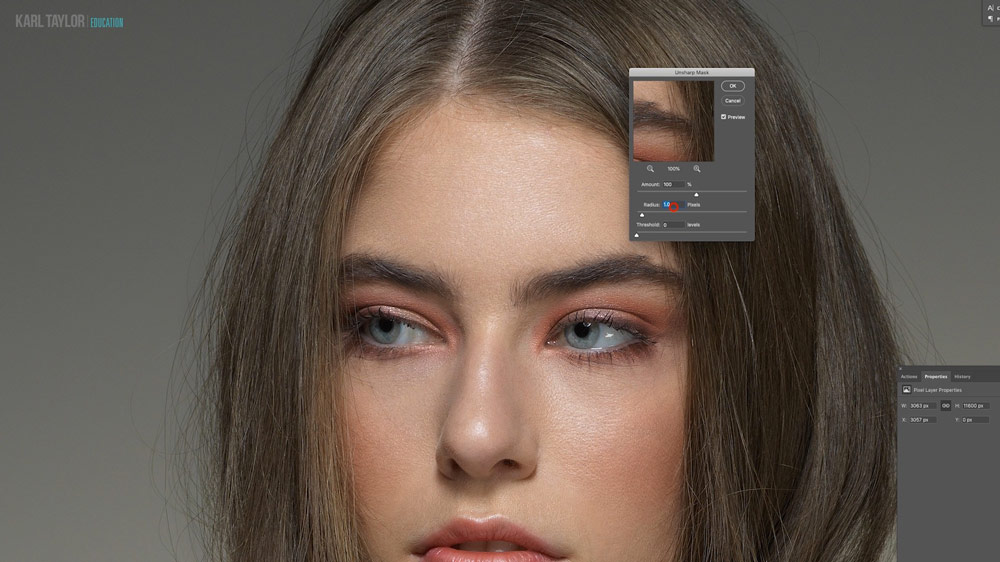
Increasing the apparent sharpness of an image can help enhance the reproduction quality of an image.
Sharpening images by adding noise.
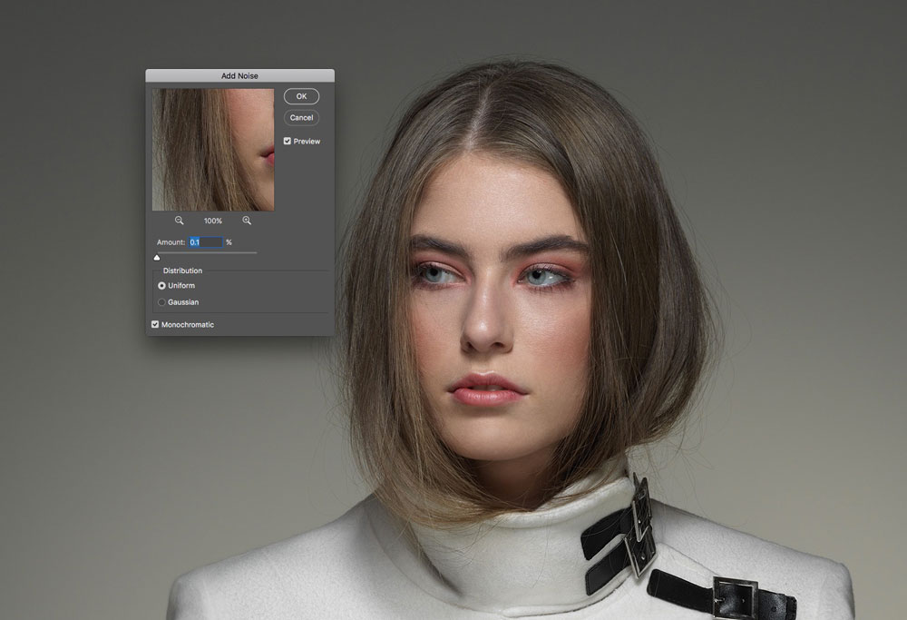
Adding noise is another technique commonly used before printing images.
Testing and comparing results.
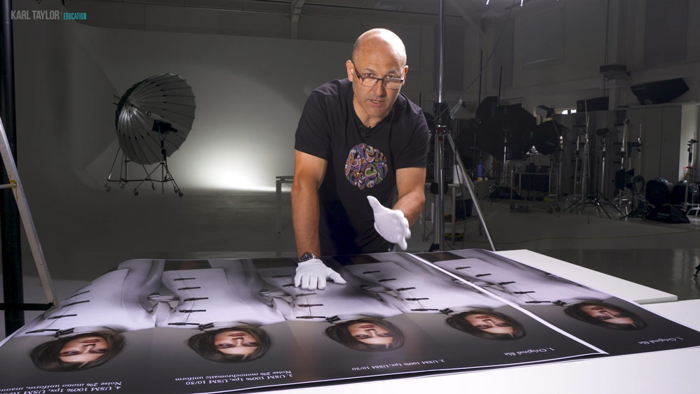
It’s worth printing tests of various settings to see what combination works best.
To learn more about printing your images, watch our special guest interview with professional printer John Fitzgerald. You’ll also find a range of more in-depth demonstrations on how to use other useful Photoshop tools in our Post-Production section.
Comments
16m22s
Why do you unsharp mask for sharpening images??
Hi, there are a number of tools to sharpen images including some independent ones and other methods such as frequency separtation, apply image or the simple sharpen commands. Over many years I’ve tested them all and the unsharp mask command at various settings based on the original resolution of the image and it’s existing sharpness is what works best for me. I’m also using USM as a local contrast boost too.
Instead of getting a color calibrated monitor why can’t you just select Adobe RGB color profile for your monitor?? What’s the difference?
Hi, selecting a colour profile doesn’t mean that the screen will be accurate to that colour. That’s a bit like saying I’m going to walk 20 meters on this straight line in Meters not feet but without something to measure it you will never know how accurate you were. A calibrated monitor works because a calibration device measures the colour coming out of the screen itself and matches and adjusts it to predetermined expected measurements. All screens also shift over time just like paint colours fading over time in sunlight, Eizo’s automatically recalibrate themselves every 200 hours because of this.
Hello Karl,
This is a very helpful lesson, as usual, thank you!
I was wondering if you ever tried the new « super resolution » feature of adobe camera raw?
If so, what are your thoughts on it versus the enhance filter with regard to large prints?
Thanks and kind regards
Remi
Hi Remi, thank you. Yes I have used Super Resolution but I prefer Topaz Gigapixel which seems to provide better results. I already use it for my large fine art work and it works really well. I tend to enlarge by 1.5 or 2x maximum if necessary. We wrote a whole blog post about my tests: https://visualeducation.com/enlarging-images-photoshop-super-resolution/
Thank you so much for your reply Karl, this looks very interesting I will definitely try this tool.
Kind regards
Hi Karl, I was always told that sharpening should be the last thing applied AFTER you’ve resized the image for the print size required. Do you agree with this or do you apply your sharpening methods to the original file and then resize to the correct print size?
Thanks for the information, it is always difficult to get it perfect, but having a lab / shop that can consistently print is quite key, I can send my images to them and I know how I need to alter my files to get the best images from them as I have done similar tests to the one in the video, although on a much small scale !
By the way the sensor spot on the video camera confused the hell out of me for a few moments, thought you had left one on the print on purpose 🙂 I’m guessing a Sony mirrorless camera as I get similar spots by just looking at the camera.
Hi Carl!
Do you plan to place subtitles for this video? They are very necessary for some members of your community 🙂
Sorry, Karl. Incorrectly spelled your name.
Hi Alex, most of our courses have subtitles in english and all new courses will eventually have them it’s just trying to keep up with them all! 🙂
Karl, I print so infrequently that I am never really comfortable with making adjustments just for printing so your lesson is very helpful. That being said, it seems like I have more issues with luminosity than sharpness, printed images always see 1/2 to 1 stop darker. I have always attributed that to the difference between a monitor (which emits light) and a paper image (which reflects light). Do you run into this?
Hi Bob, yes if viewing on a high contrast screen like an imac fro example. If viewing on a calibrated Eizo or other high quality proof screen then the prints look 95% like the screen although the viewing conditions of the prints also have a huge impact… For example I got some prints back from the lab the other day and I thought that they looked a little dark until I took them closer to the window and realised it was my office that was dark! 🙂
Nice tutorial! I’ve been using noise as the last stage of photoshop composits for years. I use another method though: I fill an empty layer with 50% gray and then change te blend mode to softlight. I then turn the layer into a smart object and add noise using the camera RAW filter. This has beautiful noise and gives control over the amount, size and roughness of the noise. And of course you can change the opacity of the noise layer to change its effect.
Works like a charm!
Thanks for the tips John, I’ll certainly give that a look.
Excellent tutorial! Thank You!
Would you apply the same techniques to landscape photos?
Hi Steve, yes and I would consider selective sharpening increased on certain key areas.
Thanks again for this video..
You’re welcome.
I really enjoy that and the information that gave us . and may me feel I need to look into getting myself a new screen thanks again Karl
P/S your lens on that shoot was dirty show up on r/h side two big marks
take care Frank
Cheers Frank, we will look into the lens issue.
Sorry Karl. Another question: do you ever push your dpi value beyond 300? Say 1000?
Thanks,
Jorge.
Hi Jorge, No I don’t but there could be occasions with special book printing that has a 400-600 dpi that you would want to.
Hi Karl,
Excellent video. I was looking forward to something like this.
Question: do you ever use High Pass filter in an overlay blending mode to sharpen your images? How does your method compare to high pass?
Thanks a lot in advance.
Jorge.
Yes I have and my associate Tim Flach uses an automated version via actions of that for some of his work. There are also some independent plug ins for sharpening that people swear by and from what I’ve experimented with it’s useful being able to adjust some of the paramaters based on higlights and shadows with a little bit more refinement but to be honest I’m not doing a lot of printing that it matters so much to me. My clients use pre-press houses for magazine and bill board ads that take care of that side of things. I would suggest trying several side by side and running your own printing tests similar to how I did here with your printer.
Hello Karl, thank’s for these precious tips. And what about ICC profil ? Is it a good thing, when possible, to get it from labs and use it for proofing in Photoshop ?
Hi Thierry, only if you have a top end calibrated monitor otherwise you aren’t going to see the difference. Most labs run and Srgb profile for printing to Inkjet or Theta through a RIP, profiling for CMYK though for printed books can be useful as the type of printing machine (Heidelberg etc) will have their own CMYK profiles. Different materials such as Ink Jet Rag, Acrylic dye bond etc will all have their own characteristics on how the final image looks but these are hard to accommodate on screen. I’d suggest test prints and keeping a library of them or samples from the printers your best bet to understand how something is going to look.
Thank’s for reply.