


Colour Theory
Understanding colour and colour theory is crucial in photography, but this is a vast topic that could easily make up a section of its own. Instead, in this class, Karl introduces you to the concept of colour and provides a basic understanding of colour theory and how you can apply it to enhance your photography.
Here you’ll learn about primary and secondary colours, different colour models, hue, saturation and brightness and also how to control colour (this is also covered in more detail in this class here).
This Photoshop class covers the following:
- Primary & secondary colours
- Colour models
- What is a pixel
- What is Hue, Saturation and Brightness
- How to correct colour
- Bit depth explained
- Colour profiling
If you have any questions about this class, please post in the comment section below.
Key concepts:
Understanding colour
One of the first things to look at and understand when it comes to colour theory and photography is the colour wheel. This will help you visualise different colours and understand how they interact. You can see each of these colours reflected in the most commonly used colour model — the RGB colour model.
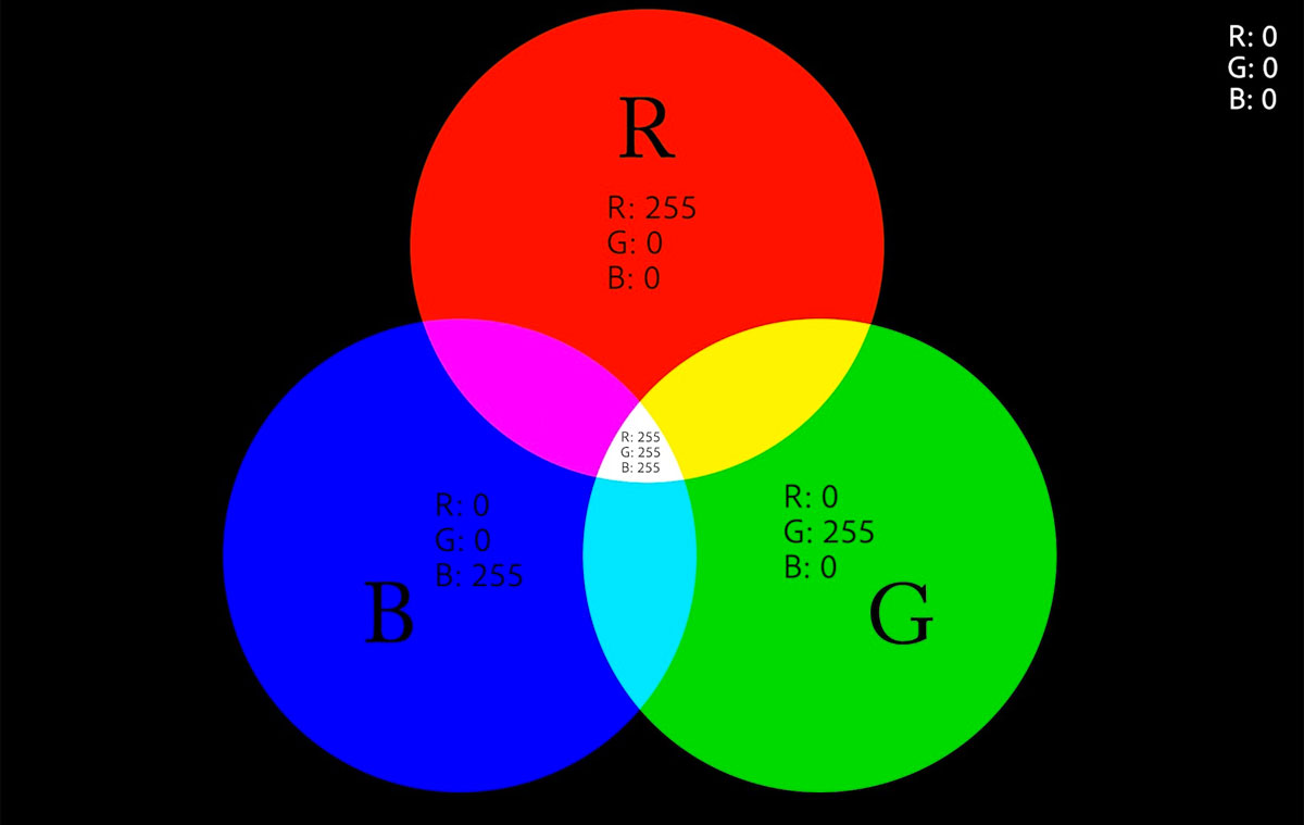
The RGB colour model, indicating the different RGB values of primary colours.
What makes up colour
As you probably already know, images are made up of thousands of little squares called pixels. Each of these squares is defined by a colour, brightness and saturation value. By controlling colour, essentially, we’re simply adjusting the colour, brightness and saturation of each of these individual squares.
Every image is made up on thousands of pixels.
How to adjust colour
Using either the RGB, CMYK or Lab colour models, you can quickly and easily adjust the colour of your image. This is something we look at in more detail in this class here.
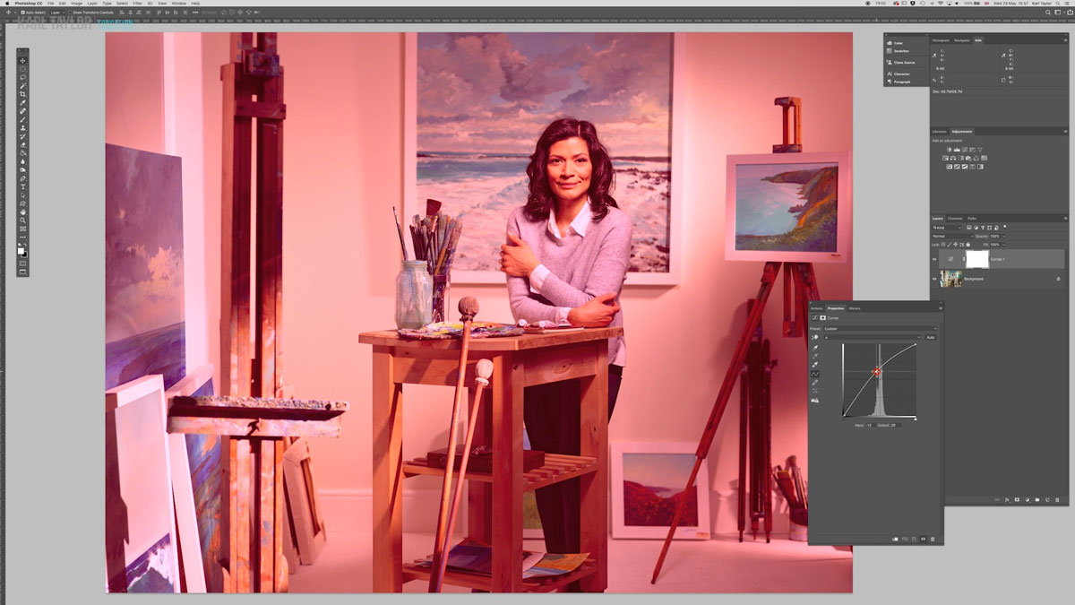
There are different methods for adjusting colour in Photoshop.
Comments
In Lightroom following your settings in photoshop I am setting them in Lr but in the “external editing” panel, Lr tells me that Adobe RGB (1998) does NOT encompass the full range of colors in lightroom so to use “PROFOTO RGB” do you agree??
Hi, no I do not recommend you using Profoto RGB as you will be working with a much wider gamut than can be reproduced in print and is wider than most screens. You are better to use Adobe RGB as this is pretty much the standard for print conversion to CMYK.
With Lr image enhancement feature, do you double pixels before your image corrections or do you want to be done with all the modifications and then only do you double resolution at the end??
Hi, I’m sorry I don’t understand what you mean by double pixels? Also I don’t use the image enhancement feature in LR, what do you mean by this?
The enhance feature of Lr double the resolution hence double pixels
Hi, is that the same as ‘Super resolution’ in PS camera raw? I’m afraid I’m not familiar with it in LR.
Yes there’s only one function in Adobe that enhance image by doubling pixel size
OK then in answer to your original question I do all my work on the original file and get it perfect before I would do any enlargements. I use Topaz Gigapixel for doubling resolution if I ever need it.
Thank you very much, knowing exactly how you work is very important to us as you know what mistakes you did in your organisation in the past 20y, so you are an example for us, of someone that get everything done as perfectly as possible.
Thank you for the time to answer to us !!!
Hello Karl First of all thank you for simplifying this so much, it’s amazing how informative it is.
I’d Like to ask, back in Visual Communication Classes we learned that mixing hues with different shades of grey gives a different result that mixing hues with more black or more white.
I guess Brightness is the way to add more black or more white to my Colors, is there a way if i want to play on the spectrum of HUE/GREYSCALE?
Hi Kevin, thank you but I’m a little confused as to what you are trying to do here. In your visual communications class were you dealing with paint and ink? If so this is very different mixing process compared to the RGB additive spectrum of mixing light. In photography grey can only be called grey if it is equal in Red Green and Blue, so for example R140, G140, B140 or R11, G12, B12 or even R216, G216, B215 when RGB values are all even can they be called neutral grey (Black is R0 G0 B0) and white is (R255, G255, B255). In the days of litho printing on a printing press we are dealing with YMCK (K being black) and it was common to add a little CYAN to give a better black but that was down to the impurities and perception of ink on paper, nothing to do with light. So if you can explain a little more what it is you are trying to do then maybe I can help further.
Great presentation – thank you. We will be making subjective decisions based on what we see on the monitor. Do you cover monitor calibration etc somewhere?
Hi Sally, I’m pretty sure monitor calibration is covered somewhere here but not sure which class, it may be in the ‘equipment’ section. The best place to head for calibrators and information is X-rite or Datacolor. Certain monitors such as Eizo colour edge have built in calibrators and take care of it all automatically.
Thanks very much.
Very nicely done Karl. After watching this training video, I realized how little I knew about Colour theory. I loved the plan view colour wheel and 3D representation of colour space which included the brightness component. I was able to find the same or similar graphic color space representations of the colour wheel on-line. The wheel I found calls out the RGB values (0-255) for each primary and complimentary colour. This is a helpful starting point. I have the colour wheels printed and posted in my office until I have the concepts memorized. Thank you Karl for a rich training experience!
Hey Karl,
That was one of clearest descriptions and presentation of color theory and it’s relation to photography and photographic editing.
Thank You!
Thank you.
Hi Karl,
Greetings for the day!!!
Wow….. What an excellent presentation on colour model. I am sure this model and the other model of Colour adjustment will benefit all. Once again let me thank you to explain it so minutely and in so easy way.