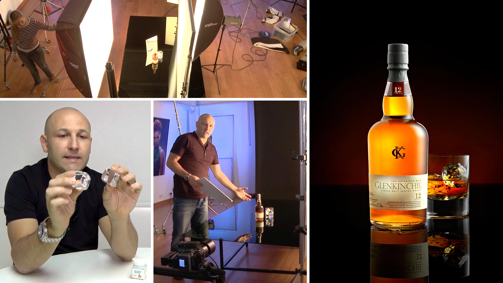

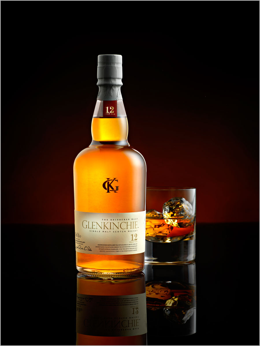
Whisky Product Shoot
You can take pro-quality bottle shots – and here’s the proof…
Glass bottles present a challenge for photographers. But they can be key to successful advertising and product photography careers. The techniques for shooting glass and liquids require a certain discipline and knowledge that, once acquired, will help you understand a variety of other similarly difficult lighting situations.
In this class, Karl outlines the most important things to consider when shooting these subjects, including the lighting on the bottle, the vibrancy of the liquid, and what glass and ice cubes to use.
He also explains why and how to use gradient lighting, how to control reflections in glass, and how to light details like the label.
In this class:
- How to photograph glass bottles
- Lighting setups for beverage photography
- How to create gradient lighting
- Controlling reflections in glass surfaces
- Techniques for lighting liquids
To see how Karl retouches this image, check out Whisky Product Retouching.
If you enjoy this class, you might also like to watch Whisky Photography.
Questions? Please post them in the comments section below.
© Karl Taylor
Comments
Hi Karl,
Could you please lend me the name of the floating ice cubes, the ones that you put in water, and if it is not too much to ask, where can I buy them. On the other hand, I have a few from Trengrove Studios, now represented by the SetShop in NY, If you ever need them, don’t hesitate to let me know, I have symmetric and asymmetric.
On the other hand, I enjoyed your Live on Photography Biz, so on the point and on reality. I saw some of my sins there, so thank you for your sincerity, I agree 100% with you.
Thanks a lot, Karl,
Hi, try these guys – https://www.thesnowpeople.com/ice-frost-c2
Thank you, Karl,
Hi Karl, what sort of size perspex would you recommend for a shoot with similar sized products while also being quite multi-purpose? I’m thinking around 900 x 1500 from what I can tell from the video? Also I may have missed it but is 3mm a good thickness or should I go thicker as will be special order so want to get ‘right’. Thanks
Hi Cameron, the thickness as a base surface doesn’t really matter so 3mm is fine. I have sheets in 1.2m x 1.2m for most stuff but I also have 1m x 1.5m
Hi Karl, what kind of scrim is generally better for product shots? Fabric ? Full stop ? 1/4 stop ? If I use a lee filter will it create the same effect ?
Thank you so much!!
Hi only proper Lee diffusion material like we use. Fabric doesn’t work for products.
Honestly – so informative. WONDERFUL tutorial. Now going to watch the Live Version 🙂
Hi Karl,
The tutorial is amazing, thank you. But when you are showing the details on the screen, we cannot see it because the camera man is to far away.
Hi Karl,
Quick question..
When do you use silver or golden reflector card?
Thank you, you are an amazing teacher and a very patient human being!
Hi it depends on the colour of the liquid in the bottle, for whisky I generally use gold and for clear spirits such as Gin you would use silver, however some whiskies already have a very rich colour and in those instances it is better to use silver.
Both of the whiskey examples showcase a round circular bottle where the light behaves the same. Can you demonstrate how to light a bottle that has a more ‘boxy’ feel like a Woodford Reserve?
Hi, Our Chanel perfume examples are a more ‘boxy’ shape but I’ll keep that in mind for a future bottle shot tutorial and live show.
Absolutely love this video. I used the methods you teach on a recent product shoot and although I am a complete novice to product photography the client was more than pleased. Thank you for the info!! You Rock Karl!!
Wondering if you would be able to put together a tutorial on the shot you cut the bottle and put an apple into it. Would love to see how that was done. I don’t see the photo here but it is one of my favorite shots. Hope you are able to put this in.
Thanks again!!
Jay
Hi Jay, thank you for your comments. I’ll explain how the cut bottle shot was done in a future live show.
Hi Karl,
I’ve already watched many of your tutorials (product, portrait..) and I’ve to say that they were all great; this is the best educational/training place for photography I’ve seen up to now. I have a question on scrims. I have at home a roll of Savage Translum. What do you think of it as scrim/diffuser for this (whisky) shoot and for others?
Thanks
Enrico
Hi Enrico, thank you for your comments. I’m not familiar with that one but give it a try on a glossy surface and check how clean the gradient looks.
Is there any change in commerical photography business in last 10 years
Thank you Will, I think it was simply due to the size of the glow on the back ground. The perspective or magnification of your lens also changes the apparent size of the the background effects. I could have chosen to have the background closer of course and reverted to an 80mm. In addition over the years i’ve preferred and used different lenses for product work, for a while I favoured the 80mm to create a greater sense of intimacy but more recently I’ve been fond of using my new 100mm (73mm)!
Super, thanks Karl.
Hi Karl, thanks for this, awesome as always! I was just wondering why you used a 150mm (101.3mm) lens for this shot instead of your usual 80mm (50mm) lens? Was it to get a better perspective for the shape of the bottle? Many thanks. Best Will
Hello Karl! I’m so excited to finally be apart of your learning techniques! I did have a question, do you have a link to where I might find those specific ice cubes? The ones I’ve purchase look entirely too fake. Thanks again and I look forward to learning a lot from you!
Hi Eric, I’m sorry the company we used to purchase from was here http://www.fakeplasticicecubes.com/ but it seems to be not working?
Hi Karl,
In this shoot your using a rather large sheet of Perspex. Would a smaller sheet work as well or is there a benifit to using such a large sheet.
Also, what are the ratios of the lights you are using in this setup ?
Hi Niall, yes a smaller sheet would have been just as good, in some ways better (width wise) as you can get the lighting closer for a softer look, length wise you still want some distance so you don’t have to have a sharp horizon. I don’t bother with lighting ratios, as every subject is different, different texture, reflectance, refraction etc etc, I only make my lighting decisions based on what I see. For more info on the theory of lighting and the way I work and to learn to ‘see the light’ then watch the first 15 chapters in the ‘Portrait’ section. Cheers Karl.
Countless thanks Karl for the invaluable information. I’ve just won a local contest with a cognac bottle photographed the way you’ve learned me. I’ve seen some tips from you regarding photoshooting a bottle incolor in colour (vodka). Why not making a tutorial for that too? Thanks again, Bogdan.